Jaguar’s Rebranding: A Landmark or a Lighthouse?
In the busy world of branding, a logo works like a clear sign—it shows people where to go and helps them recognize and connect with a brand quickly. It’s how people locate and recognize a brand amidst the noise of competition. Losing this identity is like taking away a map—customers feel lost and unsure how to trust or connect with the brand. In branding, this disruption can erode customer loyalty and make it harder for them to connect with what they once valued. This is why a branding mistake can feel so confusing—it risks losing what makes a brand special and leaves people unsure about it.
A logo’s effectiveness cannot hinge on subjective preferences alone. Instead, it should reflect the brand’s core values, serve as an authentic representation, and strategically communicate with its intended audience. With these principles in mind, Jaguar’s new branding makes me curious but also a little unsure. It’s a bold departure from their established identity, sparking questions about how it aligns with their legacy while offering a glimpse into their envisioned future. This mix of admiration for the design and uncertainty about its fit creates a fascinating tension worth exploring.
The New Jaguar Logo: Aesthetic Excellence Meets Questionable Familiarity

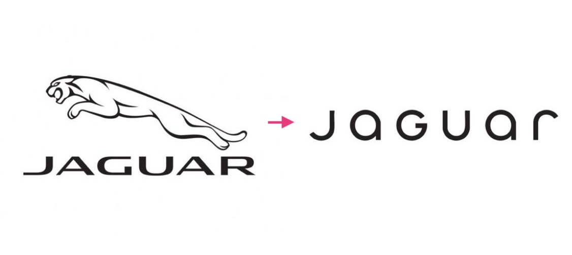
At first glance, Jaguar’s new logo is undeniably striking. It’s modern, minimal, and sleek—qualities that align with the aura of a high-end luxury car brand. On a purely design level, it hits all the right notes. If viewed in isolation, the logo is exemplary work, projecting sophistication and elegance.
However, when contextualized within the legacy of Jaguar, it prompts an important question: Is this new design a good representation of the brand?
When I first saw it, I couldn’t shake the feeling that it resembled the logo for Dune. The thin, futuristic typography and minimalistic design aesthetic share a striking similarity, which makes the new Jaguar logo feel less unique and more reminiscent of a sci-fi brand.
For a brand as iconic and recognizable as Jaguar, this similarity felt awkward. The moment you think of Jaguar and cars, the image of their classic leaping-jaguar logo springs to mind. While the updated version still includes a nod to the iconic leap, its aesthetic feels distinctly different.
It’s like heading to your favourite supermarket, only to find the sign and colours have completely changed. You’d still recognize it eventually, but that moment of surprise can throw you off. Despite knowing the products and experience inside are the same, the change is disorienting. You’d hesitate, even if only for a moment. That hesitation—that disruption of recognition—is what I feel with Jaguar’s rebranding.
Internal Conflicts and Outsider Perspectives
A recent report I came across on The Drive (Leaked Memo Reveals Jaguar Designers Were Worried About Rebranding Years Ago) reveals that Jaguar’s rebranding was handled by a third-party agency, not their internal design team. It seems the internal team wasn't so sure about this change, and some struggled to embrace it.
Personally, I think involving an external agency for rebranding is a smart move. When a brand’s identity feels dated or stagnant, an outsider’s perspective can bring much-needed clarity and fresh ideas that might be harder to see from within. However, for this approach to succeed, it requires collaboration and alignment among all stakeholders.
If different factions within Jaguar were not happy over the direction of the rebranding, with one group dominating the process without respecting others, it’s no surprise that internal conflicts would arise. And ultimately, it shows in the final result.
A Tale of Successful Rebranding: Lessons from Starbucks

Rebranding isn’t easy, especially for world-famous brands. Among the success stories, Starbucks’ evolution stands out. Their rebranding not only modernized the logo but also retained the core elements that consumers had come to associate with the brand. The "Siren" was kept as the focal point, maintaining instant recognition, while the green palette was subtly refreshed to feel more contemporary. By simplifying the design and removing text, they streamlined their branding without alienating loyal customers, making it a perfect balance of continuity and innovation. Their “Siren” logo retained its core identity through the transition. While the design was simplified and modernized, the green palette was refreshed to appear brighter and more vibrant. By maintaining the iconic siren, Starbucks preserved its “landmark” status, even as it embraced a cleaner, textless design.
Jaguar’s approach, by contrast, feels less rooted in continuity. Rather than modernizing its existing identity, it ventures into an almost entirely different impression—one that risks alienating existing brand loyalists.
A Lighthouse for the Future?
When I shared my thoughts with Justin, my business partner and co-founder of Sadie, he offered an insightful perspective. He suggested that this rebranding might not be about the present but about the future. Jaguar is transitioning to an all-electric, high-luxury identity, with a design aesthetic that leans into a fashion-forward sensibility. Perhaps the goal is to resonate with younger, future generations—to position Jaguar as a forward-thinking, stylish brand for the modern luxury consumer.
From this angle, the new logo acts less as a landmark and more as a lighthouse—guiding the brand toward its envisioned future. It’s a compelling interpretation that reframes the decision as a bold move to redefine the brand for emerging audiences.
A Curious Case of Rebranding
This isn’t to say that Jaguar’s rebranding is inherently flawed. On the contrary, it’s a fascinating exercise in strategic decision-making. The sleek, modern design has its merits, and it undoubtedly sparks conversation. Yet, it also raises questions about the balance between evolution and recognition. How does one modernize without losing the heritage that makes a brand iconic?
I’m particularly curious about how Jaguar’s existing customer base perceives this change. Do they feel a sense of loss, or do they embrace the futuristic direction? These reactions could ultimately determine whether the rebranding succeeds in bridging Jaguar’s storied past with its ambitious future.
Final Thoughts
As a brand designer, Jaguar’s rebranding stirs my curiosity and gets my creative juices flowing. It’s a powerful reminder of the importance of anchoring design decisions in strategy and identity. Whether this move proves to be a stroke of genius or a misstep, one thing is clear: Branding, like any creative work, keeps changing and growing to meet new challenges. It reminds us how important it is to balance keeping tradition alive while embracing new ideas. Successful rebranding is not just about aesthetics but about building bridges between a brand's legacy and its future aspirations. Jaguar’s case highlights the importance of carefully navigating this path to maintain trust while inspiring new audiences. And Jaguar’s latest chapter has certainly sparked an engaging one.
Additional Links:
Jonathan Lin, “The Jaguar Rebrand Is a Good Thing,” MediumReddit user discussion on “Jaguar Cars had a logo update. What kind of?” RedditTom May, “The Jaguar Rebrand Is Already the Most Divisive of 2024,” Creative Bloq


